PivotTable, PowerBI.com, PowerPivot, Tip & Tricks

Microsoft Power BI – Part X

Continuing from my previous post. Today we will downloading the dataset into Excel from Power BI Online for analysis.

In case you have missed my previous posts here I present the link to all previous posts below.


Microsoft Power BI – Part – I

Introduction to Power BI and Creating Report from Excel Data, Local Files.

Microsoft Power BI – Part – II

Introduction to few Features of Power BI

Microsoft Power BI – Part – III

Power BI Desktop, Creating Dataset & Reports from In Premise Database installation

Microsoft Power BI – Part – IV

Power BI Gateway usage

Microsoft Power BI – Part – V

Scheduling Refresh of Dataset & Report created using In Premise Database

Microsoft Power BI – Part – VI

Power BI Content Pack

Microsoft Power BI – Part – VII

Power BI Mobile App

Microsoft Power BI – Part – VIII

Power BI Content Pack

Microsoft Power BI – Part – IX

Power BI Publisher for Excel


Login to Power BI using your credentials.

PowerBI-111

Select the Dataset which you wish to analyse, click the three dots on right and from appearing menu choose ANALYZE IN EXCEL.

PowerBI-112

You will be prompted for Analyse in Excel (preview). If you are running first time please install it.

At the same time you will be prompted for (.odc) MS Office Data Connection file to save/open.

Save and then open the File in Excel.

PowerBI-113

On opening the file you will be prompted for security concern Enable to allow it.

PowerBI-114

You will be able to see Pivot Table Fields, containing all of the Tables available in the Dataset.

PowerBI-115

Now you can play with your data to analyse and create Pivot, Charts and share with others or you can Pin back your result to Power BI Dashboards using concept we used in our previous post.


That’s all for today, I will come up with more features in my future posts.

Till then keep practicing & Learning.


Advertisement
Data Model, Development Tips, Excel, How To, Information, Instalation & Configuration, Office Integration, PivotTable, Power View, PowerBI.com, PowerPivot

PowerPivot in Excel 2013

I started the series in End of September and Starting of October on PowerPivot, Power View, PivotTable & Reports but in-between the release of Navision 2016 all the topics got scattered between other posts and I didn’t ended the topic.

Here I present all the posts link at one place which you can use as table of content for easy access and to help if any one wish to start from beginning and learn all the features & Topic on same.

PowerPivot for Excel

Start the Power Pivot in Microsoft Excel add-in

Troubleshooting: Power Pivot Ribbon Disappears

PowerPivot Creating a Data Model in Excel 2013

Adding more tables to the Data Model using Existing Connection – In PowerPivot

Add relationships to Data Model in PowerPivot

How to add Filter for data retrieval in PowerPivot Data model.

Create a calculated column in PowerPivot

Creating My First Report using PowerPivot

Basics of Power Pivot for Excel – 2013

Add Slicers to PivotTables in PowerPivot

Power View in Excel 2013

Import data using copy and paste from Excel sheet or other source for PowerPivot Data Model.

Add Excel Sheet/Table to the PowerPivot Data Model

Add a relationship using Diagram View in Power Pivot

Extend the Data Model using calculated columns

Create a hierarchy in PowerPivot Data Model

Use hierarchies in PivotTables

Create a Power View report

Create a calculated field in PowerPivot

Set field defaults in PowerPivot

Set Table Behaviour in PowerPivot

Set Data Categories for fields in PowerPivot

I will come up with more details once I get some time to explore and find anything which I feel is good to share with the community.

Till then keep Learning, Exploring and Practicing.

Data Model, Development Tips, Excel, How To, PowerPivot

Set Data Categories for fields in PowerPivot

In order for Power View to dynamically create reports based on underlying data, such as location, fields that contain such data must be properly categorized.

Open the Excel Workbook we created in our earlier post. Create a Power View report

For the Olympics data, let’s specify the categories for a few fields.

  • In Power Pivot, select Hosts. Select the NOC_CountryRegion field. From Advanced -> Reporting Properties -> Data Category: click the arrow and select Country/Region from the list of available data categories, as shown in the following screen.

ExcelData-37

  • Return to Excel, and select the Power View sheet. Expand the Medals table in Power View Fields, and notice that the NOC_CountryRegion field now has a small globe icon beside it. The globe indicates that NOC_CountryRegion contains a geographic location, as shown in the following screen.

ExcelData-38

We’ll use that geographic location in an upcoming post. It’s time to save your work, review what you’ve learned, and then get ready to dive into the next post.

I will come up with more details in my next post. Till then Stay Tuned, Keep Learning & Practicing.

Data Model, Development Tips, Excel, How To, Power View, PowerPivot

Set Table Behaviour in PowerPivot

You can set the default table behaviour, which Power View uses to automatically create report labels for the table.

This becomes useful when you create visualizations from the same table, perhaps for many different reports.

Open the Excel Workbook we created in our earlier post. Create a Power View report

We use default table behaviour in the next few steps, so let’s set it now.

Open Medals Table in Data Model, select Advanced > Reporting Properties > Table Behaviour. A window appears where you can specify table behaviour.
ExcelData-33

  • In the Table Behavior window, the Row Identifier is the column that contains only unique keys and no blank values. This is often the table’s primary key, but not compulsory to be any other field which satisfy this property. You have to select a Row Identifier before making other selections in the window. Select MedalKey as the Row Identifier.
  • In the Keep Unique Rows section, select AthleteID.

Fields you select here have row values that should be unique, and should not be aggregated when creating Pivot Tables or Power View reports.
Note: If you have trouble with reports that don’t aggregate how you want them, make sure that the field you want to aggregate is not selected in the Keep Unique Rows fields.

  • For Default Label, select a key that should be used as a default report label. Select Sport.
  • For Default Image, leave the selection as [No Column Selected], since you haven’t added images yet. The Table Behavior window looks like the following screen.

ExcelData-34

  • On the Power View sheet in Excel, select the table you created in the previous post Set field defaults in PowerPivot
  • From the ribbon, select DESIGN -> Table -> Card.

ExcelData-35

  • The table you created changes into a collection of Cards; the data is the same, but the visualization of the data has changed. The table now looks like the following screen.

ExcelData-36

Notice that the Sport field is larger than the rest, and appears as a heading for each card. That’s because we set Sport as the Default Label in the Table Behavior window when we were in Power Pivot.

I will come up with more details in my upcoming posts. Till then Stay Tuned, Keep Learning & Practicing.

Data Model, Development Tips, Excel, How To, Power View, PowerPivot

Set field defaults in PowerPivot

When you set a default field set for a table, you can simply click that table in Power View, and the default set of fields is automatically added to a new report.

Open the Excel Workbook we created in our earlier post. Create a Power View report

In today’s post, we will learn how to set defaults for our workbook that will save our time when creating reports.

Steps to Create the Default Field Set for a table

  • Select the Medals table in Data View Mode from PowerPivot Manager.
  • From the Advanced tab, select Reporting Properties > Default Field Set. A window appears that lets you specify default fields for tables created using client tools such as Power View.
  • Select Sport, Event, EditionID, Athlete, and Medal in the left pane, and click Add -> to make them the default fields.

ExcelData-31

To see how this works, switch to the Power View sheet in Excel.

  • Click anywhere on the blank report canvas, to make sure you don’t have an existing visualization selected. Your Power View sheet currently only has one visualization, which is the map you created earlier in previous post. Create a Power View report
  • In the Power View Fields list, click the Medals table name. Power View creates a table and automatically adds the five default fields from the Medals table, in the order you specified, as shown in the following screen. Make sure you don’t click on the triangle beside Medals, if you do so the table simply expands, rather than adding a new table with default fields.

ExcelData-32

I will come up with more details on this topic in my upcoming posts. Till then Stay Tuned, Keep Learning and Practicing.

Data Model, Development Tips, Excel, How To, PowerPivot

Create a calculated field in PowerPivot

Open the Excel workbook which we used in our previous post on this topic. Olympics Excel Work book.

Select PowerPivot -> Manage

PowerPivot Window will open, If Calculation area not visible below table data as shown in below screen. Click Calculation Area button in Top Right Corner.

ExcelData-27

In the Calculation Area, select the cell directly below the Edition column. From the ribbon, select AutoSum > Distinct Count, as shown in the following screen.
ExcelData-28

Power Pivot automatically created the following DAX formula: Distinct Count of Edition:=DISTINCTCOUNT([Edition])

Additional calculations in AutoSum are just as easy, such as Sum, Average, Min, Max, and others.

Let’s calculate the percentage of all medals. In the formula bar, type the following DAX formula. IntelliSense provides available commands based on what you type, and you can press Tab to select the highlighted IntelliSense option. Percentage of All Medals:=[Count of Medal]/CALCULATE([Count of Medal],ALL(Medals))
ExcelData-29

When we return to Excel Sheet we can find these fields available in Medal Table. Shown in the right side of the screen above.

Let’s create a PivotTable from Medal Table. Our Pivot Table will be designed as below screen.
ExcelData-30

I will come up with more details inn my upcoming posts. Till then stay tuned, keep Learning and keep practicing.

Data Model, Excel, How To, PivotTable, Power View, PowerPivot

Create a Power View report

In the previous post, we created an Excel workbook with a PivotTable containing data about Olympic medals and events. If you didn’t saw the previous post you can access from here.

Use hierarchies in PivotTables

In this post, we will create a Power View report to visually represent the Olympics data.

In Excel, click INSERT > Reports > Power View Reports.
ExcelData-22

ExcelData-23

ExcelData-24
Select City from Host & Sport from Medal Table. Apply Count (Not Blank) to Sport Field using dropdown list next to Field Name.
ExcelData-25
From design switch the Visualization to Map.

On the map, blue circles of varying size indicate the number of different sport events held at each Olympic Host location.
ExcelData-26
Drag Season Field to Color area. This will add different colors for different Seasons. In our case summer/Winter Red/Blue colors.

Just in few clicks now we have a Power View report that visualizes the number of sporting events in various locations, using a map, color-coded based on season.

Will come with more details in my upcoming posts, till then stay tuned, keep learning and practicing.

Data Model, Development Tips, Excel, How To, PivotTable, PowerPivot, Report

Use hierarchies in PivotTables

Recall from my previous post Create a hierarchy in PowerPivot Data Model, We will continue from where we left our earlier post.

Now we have a Sports hierarchy and Locations hierarchy, we can add them to PivotTables or Power View, and quickly get results that include useful groupings of data.

Prior to creating hierarchies, you had to add individual fields to the PivotTable, and arrange those fields how you wanted them to be viewed.

In this post we will use the hierarchies created in the previous post to quickly refine our PivotTable.

Open the Excel workbook which we used in our previous post and Insert PivotTable as shown in below screen.
ExcelData-17

  • Add field in the PivotTable Medal from Medal Table in the FILTERS area, and Count of Medal from Medal Table in the VALUES area. Your nearly empty PivotTable should look like the following screen.

ExcelData-18

  • From the PivotTable Fields area, drag SDE from the Events table to the ROWS area. Then drag Locations from the Hosts table into the COLUMNS area. Just by dragging those two hierarchies, your PivotTable is populated with a data, all of which is arranged in the hierarchy we defined in the previous steps. Your screen should look like the following screen.

ExcelData-19

  • You can expand any of those Sports in the PivotTable, which is the top level of the SDE hierarchy, and see information in the next level down in the hierarchy (discipline). If a lower level in the hierarchy exists for that discipline, you can expand the discipline to see its events. You can do the same for the Location hierarchy, the top level of which is Season, which shows up as Summer and Winter in the PivotTable.

ExcelData-20

ExcelData-21
By dragging those two hierarchies, you quickly created a PivotTable with interesting and structured data that you can drill into, filter, and arrange.

I will come up with more details and other options on this topic in my upcoming posts. Till then keep learning and practicing.

Data Model, Development Tips, Excel, How To, PowerPivot, Report

Create a hierarchy in PowerPivot Data Model

We will be using the Excel workbook we used in our earlier posts. Open the Excel file, you can find the link for download in my earlier posts or from blog Menu.

SharePath

Most Data Models include data that is inherently hierarchical. The Olympics data is also hierarchical. It’s helpful to understand the Olympics hierarchy, in terms of sports, disciplines, and events.

For each sport, there is one or more associated disciplines (sometimes there are many).

And for each discipline, there is one or more events (again, sometimes there are many events in each discipline).

The following Table illustrates the hierarchy.

ExcelData-13

In this post we will create two hierarchies within the Olympic data. Then use these hierarchies to see how hierarchies make organizing data easy in PivotTables and in Power View in upcoming posts.

Create a Sport hierarchy

In Power Pivot, switch to Diagram View. Expand the Events table so that you can more easily see all of its fields.

ExcelData-14

  • Press and hold Ctrl, and click the Sport, Discipline, and Event fields. With those three fields selected, right-click and select Create Hierarchy. A parent hierarchy node, Hierarchy 1, is created at the bottom of the table, and the selected columns are copied under the hierarchy as child nodes. Verify that Sport appears first in the hierarchy, then Discipline, then Event.

ExcelData-15

  • Double-click the title, Hierarchy1, and type SDE to rename your new hierarchy. You now have a hierarchy that includes Sport, Discipline and Event. Your Events table now looks like the above screen.
  • Still in Diagram View in Power Pivot, select the Hosts table and click the Create Hierarchy button in the table header, as shown in the following screen.

ExcelData-16

  • An empty hierarchy parent node appears at the bottom of the table.
  • Type Locations as the name for your new hierarchy.
  • There are many ways to add columns to a hierarchy. Drag the Season, City and NOC_CountryRegion fields onto the hierarchy name (in this case, Locations) until the hierarchy name is highlighted, then release to add them.
  • Right-click EditionID and select Add to Hierarchy. Choose Locations.
  • Ensure that your hierarchy child nodes are in order. From top to bottom, the order should be: Season, NOC, City, EditionID. If your child nodes are out of order, simply drag them into the appropriate ordering in the hierarchy. Your table should look like the above screen.

Your Data Model now has hierarchies that can be put to good use in reports. In the upcoming posts we will learn how these hierarchies can make our report creation faster, and more consistent.

Stay tuned for more details, will come up with usage of hierarchy in my upcoming post.

Till then keep learning & practicing.

Data Model, Development Tips, Excel, How To, PowerPivot, Report

Extend the Data Model using calculated columns

Recall from my previous post Add a relationship using Diagram View in Power Pivot

Which I have left with below note. I will be continuing from where I left my previous post.

It’s nice when the data in your Data Model has all the fields necessary to create relationships, and mash up data to visualize in Power View or PivotTables. But tables aren’t always so cooperative, so in today’s post will describe how to create a new column, using DAX that can be used to create a relationship between tables.

Open the Olympics Excel sheet which we used in our previous post.

ExcelData-7
Delete the column EditionID from sheet Medals & Hosts Table/Sheet.
ExcelData-8

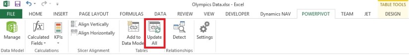
After deleting the Column EditionID from Table/Sheet Select Update All in Ribbon from PowerPivot Tab. This will update the column in Data Model.

Since we are going to learn creating relationship on calculated fields.

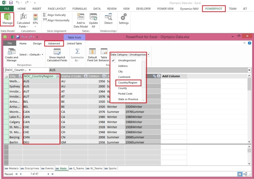
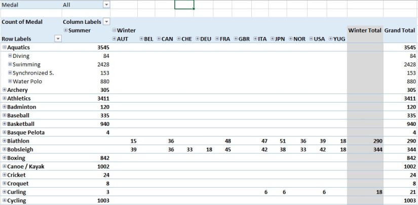
In Hosts, we can create a unique calculated column by combining the Edition field (the year of the Olympics event) and the Season field (Summer or Winter). In the Medals table there is also an Edition field and a Season field, so if we create a calculated column in each of those tables that combines the Edition and Season fields, we can establish a relationship between Hosts and Medals. The following screen shows the Hosts table, with its Edition and Season fields selected
ExcelData-9

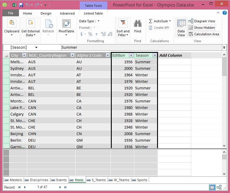
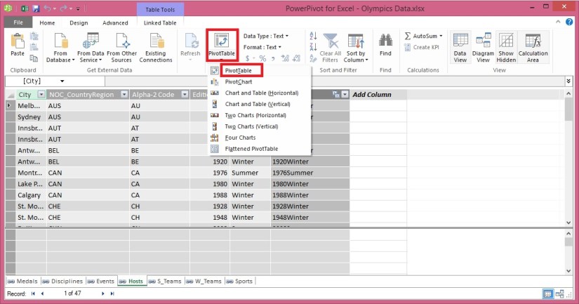
Select the Hosts table in Power Pivot. Adjacent to the existing columns is an empty column titled Add Column. Power Pivot provides that column as a placeholder. There are many ways to add a new column to a table in Power Pivot, one of which is to simply select the empty column that has the title Add Column.

In the formula bar, type the following DAX formula. The CONCATENATE function combines two or more fields into one. As you type, AutoComplete helps you type the fully qualified names of columns and tables, and lists the functions that are available. Use tab to select AutoComplete suggestions. You can also just click the column while typing your formula, and Power Pivot inserts the column name into your formula.

=CONCATENATE([Edition],[Season])

When you finish building the formula, press Enter to accept it.

Values are populated for all the rows in the calculated column. If you scroll down through the table, you see that each row is unique – so we’ve successfully created a field that uniquely identifies each row in the Hosts table. Such fields are called a primary key.

Let’s rename the calculated column to EditionID. You can rename any column by double-clicking it, or by right-clicking the column and choosing Rename Column. When completed, the Hosts table in Power Pivot looks like the following screen.
ExcelData-10

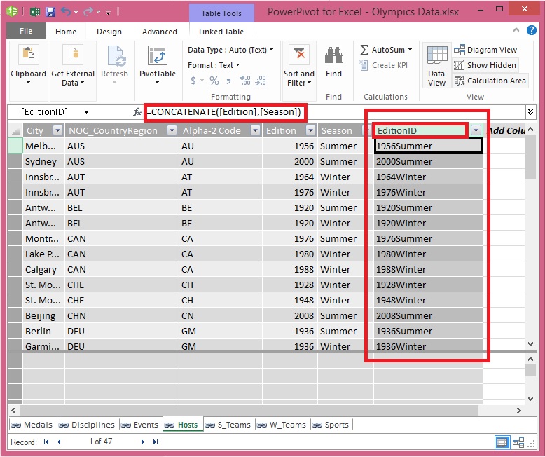
Next let’s create a calculated column in Medals that matches the format of the EditionID column we created in Hosts, so we can create a relationship between them.

When you created a new column, Power Pivot added another placeholder column called Add Column. Next we want to create the EditionID calculated column, so select Add Column. In the formula bar, type the following DAX formula and press Enter.

=CONCATENATE([Year],[Season])

Rename the column by double-clicking CalculatedColumn1 and typing EditionID.
ExcelData-11

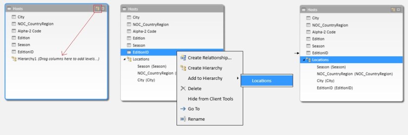
Next let’s use the calculated columns we created to establish a relationship between Hosts and Medals.

In the Power Pivot window, select Home > View > Diagram View from the ribbon.

Drag the EditionID column in Medals to the EditionID column in Hosts. Power Pivot creates a relationship between the tables based on the EditionID column, and draws a line between the two columns, indicating the relationship.
ExcelData-12

Now you can see the relationship between Host & Medal table is established on calculated field EditionID in both the tables.

Stay tuned for more details on this topic. I will come up with next step in this series in my upcoming post.

Till then keep learning & practicing.