
I started the series in End of September and Starting of October on PowerPivot, Power View, PivotTable & Reports but in-between the release of Navision 2016 all the topics got scattered between other posts and I didn’t ended the topic.
Here I present all the posts link at one place which you can use as table of content for easy access and to help if any one wish to start from beginning and learn all the features & Topic on same.
Start the Power Pivot in Microsoft Excel add-in
Troubleshooting: Power Pivot Ribbon Disappears
PowerPivot Creating a Data Model in Excel 2013
Adding more tables to the Data Model using Existing Connection – In PowerPivot
Add relationships to Data Model in PowerPivot
How to add Filter for data retrieval in PowerPivot Data model.
Create a calculated column in PowerPivot
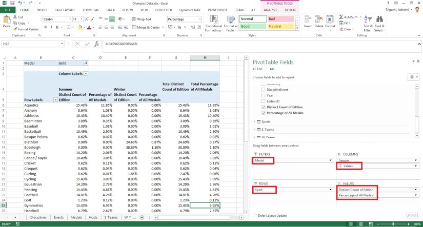
Creating My First Report using PowerPivot
Basics of Power Pivot for Excel – 2013
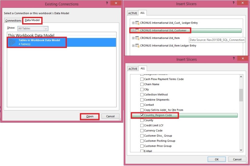
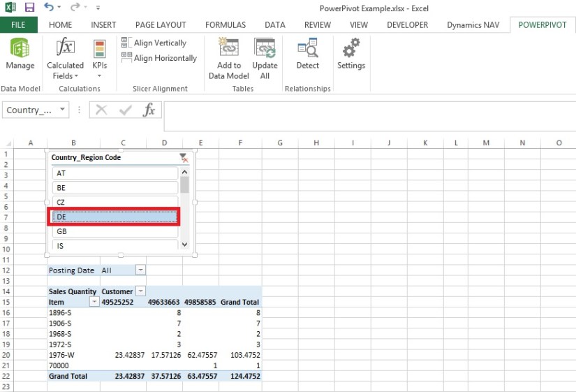
Add Slicers to PivotTables in PowerPivot
Import data using copy and paste from Excel sheet or other source for PowerPivot Data Model.
Add Excel Sheet/Table to the PowerPivot Data Model
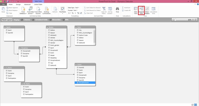
Add a relationship using Diagram View in Power Pivot
Extend the Data Model using calculated columns
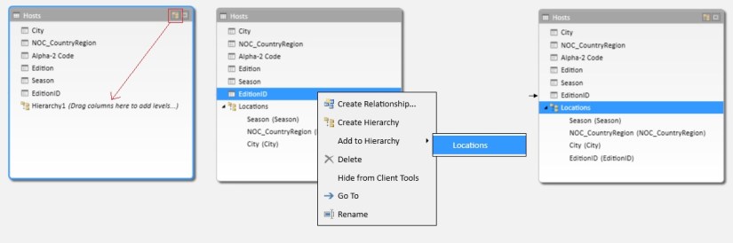
Create a hierarchy in PowerPivot Data Model
Use hierarchies in PivotTables
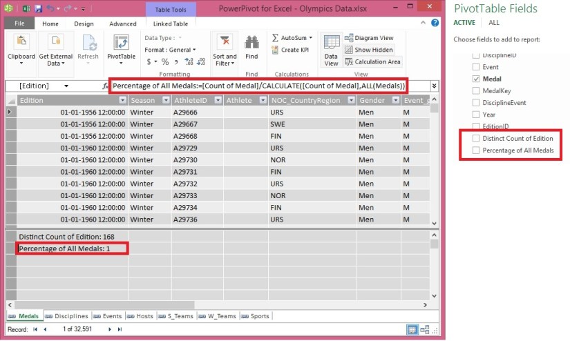
Create a calculated field in PowerPivot
Set field defaults in PowerPivot
Set Table Behaviour in PowerPivot
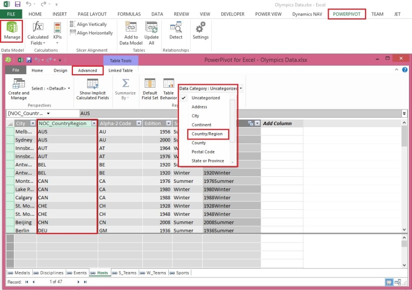
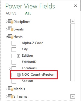
Set Data Categories for fields in PowerPivot
I will come up with more details once I get some time to explore and find anything which I feel is good to share with the community.
Till then keep Learning, Exploring and Practicing.


You must be logged in to post a comment.