PivotTable, PowerBI.com, PowerPivot, Tip & Tricks

Microsoft Power BI – Part X

Continuing from my previous post. Today we will downloading the dataset into Excel from Power BI Online for analysis.

In case you have missed my previous posts here I present the link to all previous posts below.


Microsoft Power BI – Part – I

Introduction to Power BI and Creating Report from Excel Data, Local Files.

Microsoft Power BI – Part – II

Introduction to few Features of Power BI

Microsoft Power BI – Part – III

Power BI Desktop, Creating Dataset & Reports from In Premise Database installation

Microsoft Power BI – Part – IV

Power BI Gateway usage

Microsoft Power BI – Part – V

Scheduling Refresh of Dataset & Report created using In Premise Database

Microsoft Power BI – Part – VI

Power BI Content Pack

Microsoft Power BI – Part – VII

Power BI Mobile App

Microsoft Power BI – Part – VIII

Power BI Content Pack

Microsoft Power BI – Part – IX

Power BI Publisher for Excel


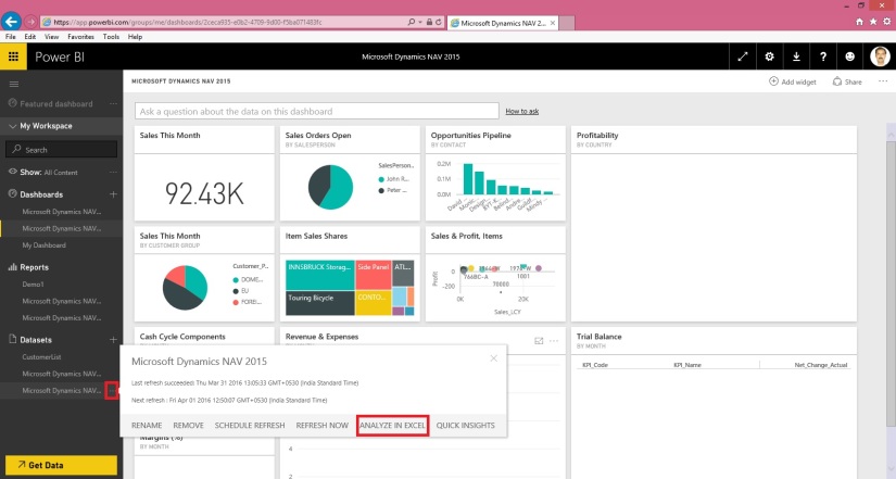
Login to Power BI using your credentials.

PowerBI-111

Select the Dataset which you wish to analyse, click the three dots on right and from appearing menu choose ANALYZE IN EXCEL.

PowerBI-112

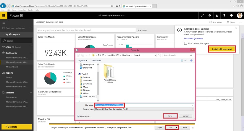
You will be prompted for Analyse in Excel (preview). If you are running first time please install it.

At the same time you will be prompted for (.odc) MS Office Data Connection file to save/open.

Save and then open the File in Excel.

PowerBI-113

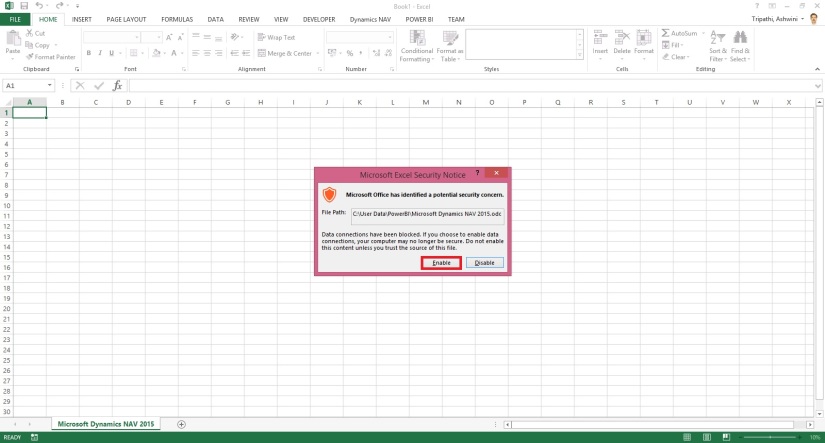
On opening the file you will be prompted for security concern Enable to allow it.

PowerBI-114

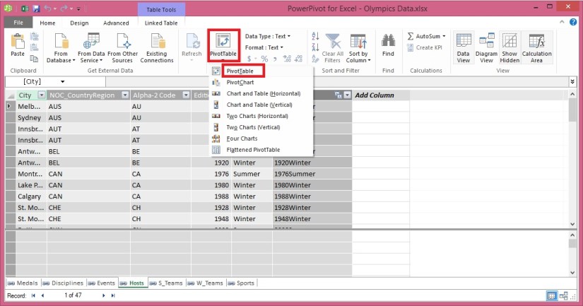
You will be able to see Pivot Table Fields, containing all of the Tables available in the Dataset.

PowerBI-115

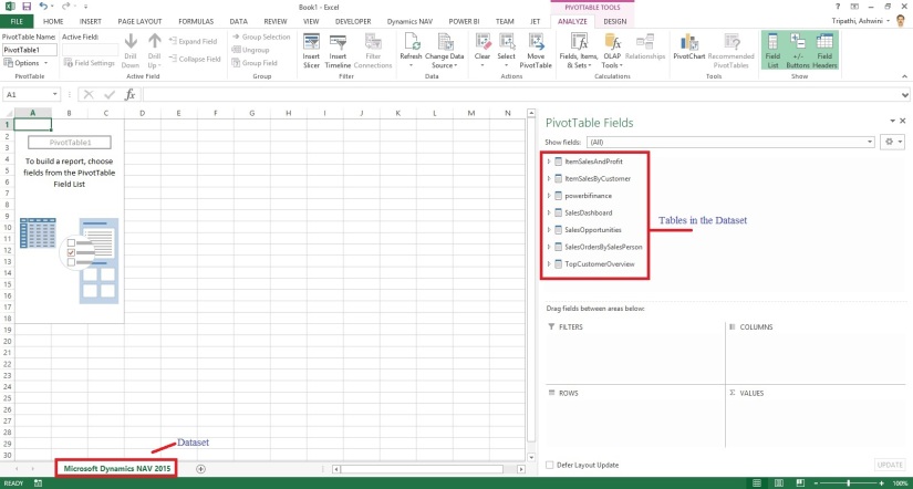
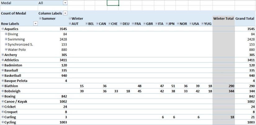
Now you can play with your data to analyse and create Pivot, Charts and share with others or you can Pin back your result to Power BI Dashboards using concept we used in our previous post.


That’s all for today, I will come up with more features in my future posts.

Till then keep practicing & Learning.


Advertisement
Data Model, Development Tips, Excel, How To, Information, Instalation & Configuration, Office Integration, PivotTable, Power View, PowerBI.com, PowerPivot

PowerPivot in Excel 2013

I started the series in End of September and Starting of October on PowerPivot, Power View, PivotTable & Reports but in-between the release of Navision 2016 all the topics got scattered between other posts and I didn’t ended the topic.

Here I present all the posts link at one place which you can use as table of content for easy access and to help if any one wish to start from beginning and learn all the features & Topic on same.

PowerPivot for Excel

Start the Power Pivot in Microsoft Excel add-in

Troubleshooting: Power Pivot Ribbon Disappears

PowerPivot Creating a Data Model in Excel 2013

Adding more tables to the Data Model using Existing Connection – In PowerPivot

Add relationships to Data Model in PowerPivot

How to add Filter for data retrieval in PowerPivot Data model.

Create a calculated column in PowerPivot

Creating My First Report using PowerPivot

Basics of Power Pivot for Excel – 2013

Add Slicers to PivotTables in PowerPivot

Power View in Excel 2013

Import data using copy and paste from Excel sheet or other source for PowerPivot Data Model.

Add Excel Sheet/Table to the PowerPivot Data Model

Add a relationship using Diagram View in Power Pivot

Extend the Data Model using calculated columns

Create a hierarchy in PowerPivot Data Model

Use hierarchies in PivotTables

Create a Power View report

Create a calculated field in PowerPivot

Set field defaults in PowerPivot

Set Table Behaviour in PowerPivot

Set Data Categories for fields in PowerPivot

I will come up with more details once I get some time to explore and find anything which I feel is good to share with the community.

Till then keep Learning, Exploring and Practicing.

Data Model, Excel, How To, PivotTable, Power View, PowerPivot

Create a Power View report

In the previous post, we created an Excel workbook with a PivotTable containing data about Olympic medals and events. If you didn’t saw the previous post you can access from here.

Use hierarchies in PivotTables

In this post, we will create a Power View report to visually represent the Olympics data.

In Excel, click INSERT > Reports > Power View Reports.
ExcelData-22

ExcelData-23

ExcelData-24
Select City from Host & Sport from Medal Table. Apply Count (Not Blank) to Sport Field using dropdown list next to Field Name.
ExcelData-25
From design switch the Visualization to Map.

On the map, blue circles of varying size indicate the number of different sport events held at each Olympic Host location.
ExcelData-26
Drag Season Field to Color area. This will add different colors for different Seasons. In our case summer/Winter Red/Blue colors.

Just in few clicks now we have a Power View report that visualizes the number of sporting events in various locations, using a map, color-coded based on season.

Will come with more details in my upcoming posts, till then stay tuned, keep learning and practicing.

Data Model, Development Tips, Excel, How To, PivotTable, PowerPivot, Report

Use hierarchies in PivotTables

Recall from my previous post Create a hierarchy in PowerPivot Data Model, We will continue from where we left our earlier post.

Now we have a Sports hierarchy and Locations hierarchy, we can add them to PivotTables or Power View, and quickly get results that include useful groupings of data.

Prior to creating hierarchies, you had to add individual fields to the PivotTable, and arrange those fields how you wanted them to be viewed.

In this post we will use the hierarchies created in the previous post to quickly refine our PivotTable.

Open the Excel workbook which we used in our previous post and Insert PivotTable as shown in below screen.
ExcelData-17

  • Add field in the PivotTable Medal from Medal Table in the FILTERS area, and Count of Medal from Medal Table in the VALUES area. Your nearly empty PivotTable should look like the following screen.

ExcelData-18

  • From the PivotTable Fields area, drag SDE from the Events table to the ROWS area. Then drag Locations from the Hosts table into the COLUMNS area. Just by dragging those two hierarchies, your PivotTable is populated with a data, all of which is arranged in the hierarchy we defined in the previous steps. Your screen should look like the following screen.

ExcelData-19

  • You can expand any of those Sports in the PivotTable, which is the top level of the SDE hierarchy, and see information in the next level down in the hierarchy (discipline). If a lower level in the hierarchy exists for that discipline, you can expand the discipline to see its events. You can do the same for the Location hierarchy, the top level of which is Season, which shows up as Summer and Winter in the PivotTable.

ExcelData-20

ExcelData-21
By dragging those two hierarchies, you quickly created a PivotTable with interesting and structured data that you can drill into, filter, and arrange.

I will come up with more details and other options on this topic in my upcoming posts. Till then keep learning and practicing.