Data, Development Tips, How To, Information, Tip & Tricks

Creating Views – to Save Filtered Lists in NAV

Do you Know you can save the Page as View with filters.

Many of time we access to Page and apply same set of Filters to fetch our data. You can save the same for quick retrival of data applying the filters automatically in future access.

You save the Page with Filters as View.

Let us see small example how to achieve it.

First we will open the List Page in my case i am having one customized Customer List.

FilteredView-1

Suppose this is the Page which i use for Balances Retrival each month and on daily basis.

I Enter Filter as Balance > 5000 & Current Month Filter whenever i wish to check balances for my reporting or followup purpose.

For Date Filter i use (-CM..CM) sothat when i open this view next month it takes the appropriate Filter for that month.

FilteredView-2

Click on the Page Name post applying all the required Filters.

Select Save View as.

Give the Name for the View.

Select the Location to save the View.

On Confirmation respond as Yes.

FilteredView-3

Your View will be Saved, You can create as much Views as desired using different Filters.

FilteredView-4

Small and good Feature.

What you are waiting for give it a try.

I will comeup with more information in my upcoming posts, till then keep exploring and learning.


Advertisement
Data Model, Excel, How To, PivotTable, Power View, PowerPivot

Create a Power View report

In the previous post, we created an Excel workbook with a PivotTable containing data about Olympic medals and events. If you didn’t saw the previous post you can access from here.

Use hierarchies in PivotTables

In this post, we will create a Power View report to visually represent the Olympics data.

In Excel, click INSERT > Reports > Power View Reports.
ExcelData-22

ExcelData-23

ExcelData-24
Select City from Host & Sport from Medal Table. Apply Count (Not Blank) to Sport Field using dropdown list next to Field Name.
ExcelData-25
From design switch the Visualization to Map.

On the map, blue circles of varying size indicate the number of different sport events held at each Olympic Host location.
ExcelData-26
Drag Season Field to Color area. This will add different colors for different Seasons. In our case summer/Winter Red/Blue colors.

Just in few clicks now we have a Power View report that visualizes the number of sporting events in various locations, using a map, color-coded based on season.

Will come with more details in my upcoming posts, till then stay tuned, keep learning and practicing.

Data Model, Development Tips, Excel, How To, PowerPivot, Report

Add a relationship using Diagram View in Power Pivot

Open the Workbook which we prepared in the last exercise in our previous post.

Add Excel Sheet/Table to the PowerPivot Data Model

  • In the Power Pivot window, in the View section, click Diagram View.
  • Use the slide bar to resize the diagram so that you can see all objects in the diagram. Rearrange the tables by dragging their title bar, so they’re visible and positioned next to one another. Notice that all tables are unrelated to each other, we will create relationship among these tables.

After adding relationship the Diagram will Look as below.

ExcelData-6

  • Let start creating the relationship.
  • Sports->SportID click and drag to Disciplines->SportID and release. You will see the relation is built between these two tables on SportID.

Similarly follow to create other relations too as shown in below image.
ExcelData-5

You notice that both the Medals table and the Events table have a field called DisciplineEvent. Upon further inspection, you determine that the DisciplineEvent field in the Events table consists of unique, non-repeated values.

The DisciplineEvent field represents a unique combination of each Discipline and Event. In the Medals table, however, the DisciplineEvent field repeats many times. That makes sense, because each Discipline+Event combination results in three awarded medals (gold, silver, bronze), which are awarded for each Olympics Edition the Event is held. So the relationship between those tables is one (one unique Discipline+Event entry in the Disciplines table) to many (multiple entries for each Discipline+Event value).

  • Create a relationship between the Medals table and the Events table. While in Diagram View, drag the DisciplineEvent field from the Events table to the DisciplineEvent field in Medals. A line appears between them, indicating a relationship has been established.
  • Click the line that connects Events and Medals. The highlighted fields define the relationship, as shown in the above screen.
  • To connect Hosts to the Data Model, we need a field with values that uniquely identify each row in the Hosts table. Then we can search our Data Model to see if that same data exists in another table. Looking in Diagram View doesn’t allow us to do this. With Hosts selected, switch back to Data View.
  • After examining the columns, we realize that Hosts doesn’t have a column of unique values. (Assume EditionID Field is not available in the Host & Medal Table, in my case I have already added this Field in my workbook I shared). In such case we’ll have to create it using a calculated column, and Data Analysis Expressions (DAX).

It’s nice when the data in your Data Model has all the fields necessary to create relationships, and mash up data to visualize in Power View or PivotTables. But tables aren’t always so cooperative, so the next post will describe how to create a new column, using DAX that can be used to create a relationship between tables.

We will see how to work with calculated fields in our next upcoming post.

Development Tips, Excel, How To, Power View, PowerPivot, Report

Power View in Excel 2013

Power View is an interactive data exploration, visualization, and presentation experience that encourages intuitive ad-hoc reporting.

Power View is a feature of Microsoft Excel 2013, and of Microsoft SharePoint Server 2010 and 2013 as part of the SQL Server 2012 Service Pack 1 Reporting Services Add-in for Microsoft SharePoint Server Enterprise Edition.

Power View has these features, as part of Power BI for Office 365:

  • Create Power View sheets in Excel and then view them in the Power BI Windows Store app.
  • View Power View in Excel sheets in your browser, without installing Silverlight.

Data sources for Power View

In Excel 2013, you can use data right in Excel as the basis for Power View in Excel and SharePoint.

When you add tables and create relationships between them, Excel is creating a Data Model behind the scenes.

A data model is a collection of tables and their relationships reflecting the real-world relationships between business functions and processes—for example, how Products relates to Inventory and Sales.

You can continue modifying and enhancing that same data model in Power Pivot in Excel, to make a more sophisticated data model for Power View reports.

With Power View you can interact with data:

  • In the same Excel workbook as the Power View sheet.
  • In data models in Excel workbooks published in a Power Pivot Gallery.
  • In tabular models deployed to SQL Server 2012 Analysis Services (SSAS) instances.
  • In multidimensional models on an SSAS server (if you’re using Power View in SharePoint Server).

Recall from my previous post Creating My First Report using PowerPivot, I will be using same Data Model to demonstrate the feature of Power View, also same report in different format.

Let’s design Customer wise Sales Report using Power View.
PowerView-1

I am using the same Workbook which we used for PowerPivot creating Matrix report for Item Vs Customer Sales.

From Insert Tab choose Power View Reports in ribbon.

Remember this workbook already having Data Model with tables Customer, Item, Cust. Ledger Entry & Item Ledger Entry. One which we created during our previous exercise during walkthrough of PowerPivot.

We already have Relationship defined between Customer & Item Ledger Entry (No. -> Source No.), also Item & Item Ledger Entry (No. -> Item No.).
PowerView-2

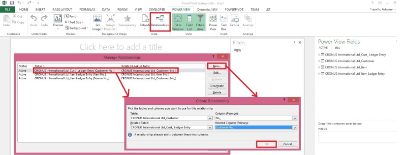
You can View the Relationship using Relationship from Ribbon Power View Tab.

Once the Power View Sheet is inserted the Power View Tab will be Visible.

This will list the two relations which we created earlier in previous exercise post.

However we will be requiring one more relationship for this report. Add using New button on Manage Relationship window.

Enter the Relation for Customer & Cust. Ledger Entry (No. -> Customer No.).

You can see all the 4 tables are listed in Field List Pane.
PowerView-3
Arrange the Fields from respective tables as shown in above screenshot.
PowerView-4
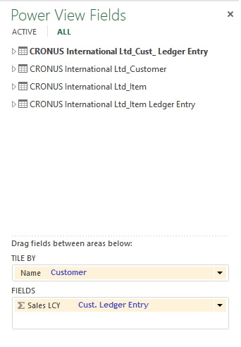
Arrange the fields as shown in above screenshot.

Design of your report should be similar to one shown in below screenshot.
PowerView-5

Resize the Table area to fit the area and the way you want to represent the data.

When a Customer is selected in Title Area, below two tables show the Item Sales Quantity & Total Value for the selected Customer.

You can add fields in the Filter Pane to slice the data accordingly.

I will come up with more details in my upcoming posts.

Till then stay tuned and keep practicing.